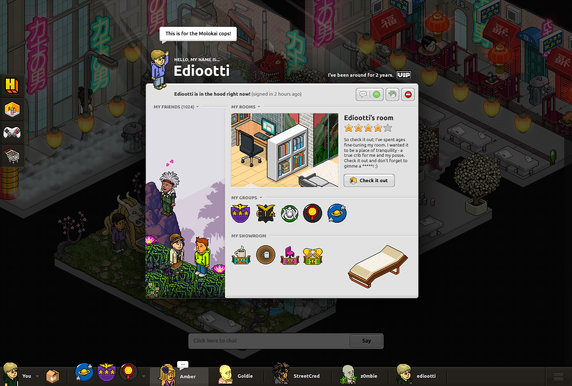
Sulake\'s UI designer Juho Paasonen aka @ediootti posted two drafts of the new \"Illumina\" project that he is designing.
Here are the pics:
1

2

Which one do you prefer?
NEW IMAGES - EXCLUSIVE PUHEKUPLA

![]()
jeppepulis98 and Dimix
Sulake\'s UI designer Juho Paasonen aka @ediootti posted two drafts of the new \"Illumina\" project that he is designing.
Here are the pics:
1

2

Which one do you prefer?
NEW IMAGES - EXCLUSIVE PUHEKUPLA

![]()
jeppepulis98 and Dimix
53 replies on “Illumina: Habbo\'s future + BIG EXCLUSIVITY”
<3
Look at the ID, 999! 1000th post will be published very soon!
Oh wow, 999 news since puhekupla is born :)
1 :D
I prefer the 2nd
1 :*
1st one tvym
second one by far :)
First one, but I\'d do some changes... :D
Juanmah.
2 - :) :P :P :P :P :P
2! Or maybe a mixture
2 :p
I prefer 1.
1 (L)
Don\'t like floating elements (like the credits on #2) on UI\'s because they waste more space and look cluttered
non
WAAAAZAAAAAAAAAA I WANT NUMBER 2
Made by my
2 NOOBS. :S 2 is beter
I\'d say 2.
I\'d say 2.
[b]OMG I HOPE THEY DO 1
THE SECOND ONE IS SO WEIRD EVERYTHINHG IS FLOATING[/b]
[b][b]NOOBS 2 is the best. [/b][/b]
[b]ALL 2 :)[/b]
jullie zijn RAAR :S
1 is the best... I liked the old version of BETA... the very first one. That reminds me of it slightly. If Habbo turn themselves around I may start playing again.
Hell to the fcks no if habbo ever becomes like this im quiting
1!!!! 1 is the best!
Marc
2
[b]yoou are all so stupid :S . WTF HEB EJ AAN EEN ZOEKBALKIE VOOR ANDERE NOOBS. En ik heb geen zin om zover met men muis te gaan voor die rot catalogus en die doos. DUS 2 is de beste[/b]
[b]2
2
2
2
2
2
2[/b]
omg no
Both are fairly nice, 1 cause its time to move passed the \"floating\" stage.
1 is cool
neither of them because 1 doesn\'t show the credits and 2 has the floating menus which annoy the heck out of everyone this guy should be fired these better not be the final drafts
No. 1
I prefer the menu on the top..
It gives you a better overview of the room.
The menu in the left site cut out the overview of the room.
It\'s better with buttons in the top and the bottom.
Sorry for my bad english..
neem een mengeling van de 2 jah :p de 1e met de cr, pixels en vip er ook op vanboven dan is ie mooi :p
1 !!!
Oh peeps
Did we already saw the maybe new catalogue?
[b]http://img805.imageshack.us/img805/3999/habbocataloguepage1.png[/b]
Greetz,
[b]DEFINTLY 1![/b]
THAT NEW FIRST ONE. I LOVE OMGGGGGGGGGGGGG
[quote=N14756] Fake.
I prefer to picture 1, but I would make \"You\" in the down line like picture 2!! ;)
This is amazing, truly amazing - I see a BIG future for Habbo, and this is just the start of it all! :P
Wow. This looks amazing. I prefer the first one, although It doesn\'t have ur credits :T
The other 2 images are amazing. Hopefully this project turns out to be successful ;D
[quote=N14766]
Thats why i said the maybe new catalogue.
It has been sent to Habbo (Sulake twitter)
And there was an reply on it.
So we will see.
Greetz.
Why are you saying those images are exclusive when over 50 fansites received it? LOL noob
HTLM5 pl0x
LOOL this is not exclusive
lelijk
[quote=N14773]
[quote=N14778]
:) Nice! :D
It looks cool and about to look like (Apple) apps ect.
Hm, I\'d prefer [b]number 2[/b],
the image could have [i]thumbnails[/i] - It\'s not very good when you can\'t see the pictures in original size :D
[i]-As, I hope you\'ll make some more of the Halloween comps xP It was fun.[/i]
[quote=N14779]
Because I was the first to put them \"LOL noob\"
Exclusive images are images you as a fansite only have. These are not exclusive, rathet you beat the rest of the bunch to posting them...
Fult.
R.I.P OLDD HABBO :(