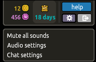
Today on .com BETA testers of the new user interface got treated with a new chat bar and an update to the settings icon - an ongoing progression into completion of the new interface. Check out today's UI updates below.
The new chat bar:

Clicking the cog icon brings up this options box:

NEW UPDATE!
A new toolbar for the bottom left side of our screen has been added:

A smaller friend bar has been added to the bottom right side:

Toolbars can now be minimized by clicking the arrows:

(I) Remember it could change and everything you see could be far from what it is now before full release.
(I) Enter this room and join the group on the .com hotel to access BETA
13 replies on “Habbo NEW UI - update3 [GREAT UPDATE]”
Really? Just a screenshot? Really shotty reporting.
Puhekupla is dead mates
We're sorry you feel that way, I have edited 123http's article into a little more depth and it's now broken down into whats what.
I totally agree.
This site is so slow if you log onto Habbo you will see what updates were changed to the site. Basically what I'm saying is Puhekupla is useless except for seeing what possible badges could come into Habbo.com.
Whats with all the hate? I love this site
Ugly beta :S
This site is awesome! Keep up the good work yall :D
Nice Design :)
It doesnt show up on my client? :(
if haven't already go this room and join the group to join the beta test: http://www.habbo.com/room/60478638
I'm happy with the third update. I couldn't see my room information because of my screen was too small for it to fit :p
Glad everything iis much smaller in the new version for example the icons, buttons, images on the right corner of the client.