It's been a little while, or a week since we've seen the last UI change on the BETA of the new toolbar. Improvements have been amended today that brings both toolbars into one, adds the old quest button onto the toolbar & improves the settings from when you click your avatar . Check it out below, and remember to leave your thoughts in the comments.
New UI: As it is now

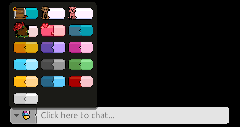
New shade of black fit up for the chat bubble settings

If you're interested in joining the BETA, join this group here
Update by desativaado.ban:
No bug's on FriendBar:

TransparentBar:

14 replies on “Habbo UI: The updates continue -part2”
And room settings
http://habbo-tropical.nl/images/uploads/ui4upd2.png
http://habbo-tropical.nl/images/uploads/ui6upd21.png
Response came from me *
[img=http://habbo-tropical.nl/images/uploads/ui4upd2.png]
[img=http://habbo-tropical.nl/images/uploads/ui6upd21.png]
New pet soon. Look for gnome.swf :D
love the hc hearts one
My Habbo name is in the animation. woo
yay...
I'm easily amused.
Yes.. yes you are ;)
http://i.imgur.com/gYYWrg2.png?1?4482
[IMG]http://i.imgur.com/gYYWrg2.png?1[/IMG]
<a href="http://imgur.com/gYYWrg2"><img src="http://i.imgur.com/gYYWrg2.png?1" title="Hosted by imgur.com" /></a>
i.imgur.com/gYYWrg2.png
Chat bugs still happening to me...
[url=http://i.imgur.com/NVfUJap.png][/url]
This new UI is one of the best updates Habbo have done in a long time. For the first time in ages, my screen isn't cluttered by buttons and crap in every direction. Really impressed.