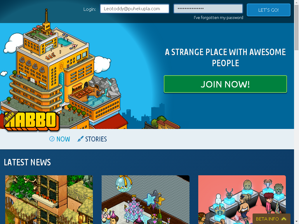
A new button to enter the Hotel was also added, now all users can connect to beta.habbo.com Hotel.
(Drag the images to a new tab to view them with best quality)
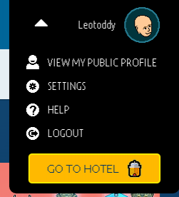
Menu button "Go to Habbo":
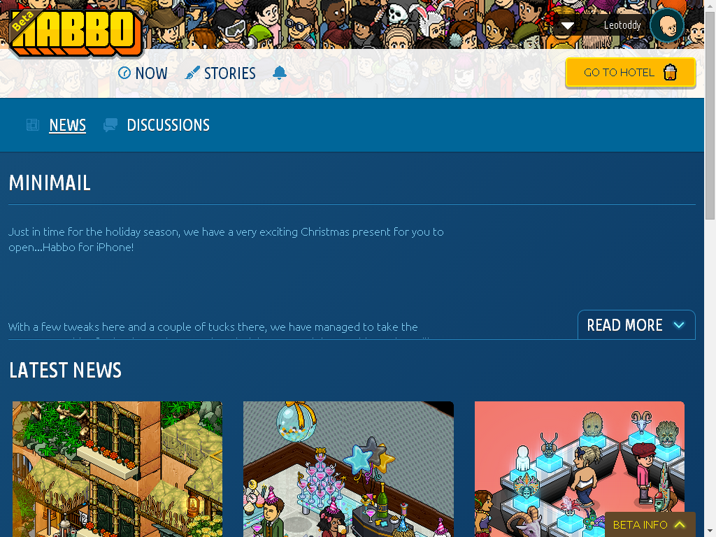
News:
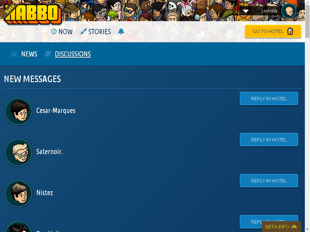
Discussions:
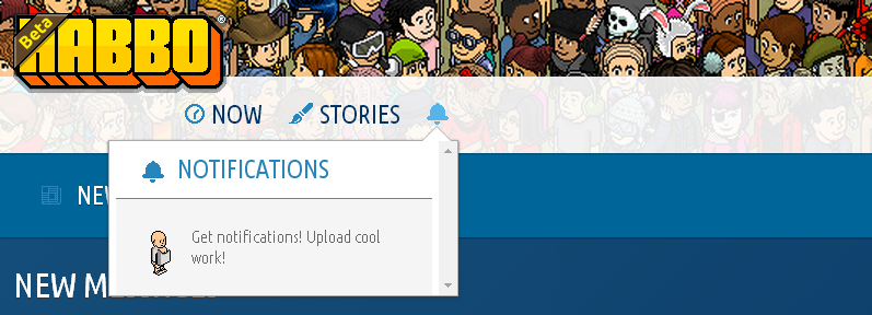
Notifications:
EXCLUSIVE!
A new button to enter the Hotel was also added, now all users can connect to beta.habbo.com Hotel.
(Drag the images to a new tab to view them with best quality)

Menu button "Go to Habbo":

News:

Discussions:

Notifications:

EXCLUSIVE!
10 replies on “New features for Habbo Beta”
YAY! :D The Habbo Home will be updated!
YAY! Habbo Homes won't exist no more! Yay! People who spent half an eye on them will be really happy with this update!
Exclusive? super old. and stop stealing
Are you blind? The features shown in the above images were recently implemented.
wats with the font.
it's not clear pfft.
i thought they wanted to move away from pixelated look to hd like UBUNTu ugly font.
Actually it's Windows font rendering what makes Ubuntu look ugly. Use a Mac and you can notice the fonts are smoother.
They should really move on and change the font. Ubuntu is horrible for 2015, I suggest using Roboto or Open Sans, cute fonts.
Why? Ubuntu and Ubuntu Condensed is a part of their visual identity. Personally, every time I see the font online, I think of Habbo. That is a strong digital brand.
Are they going to use that pixelated font? It looks good! But I don't see it when i visit the beta site.
!!!! Its the old zoom! they still remember it! bring it back!