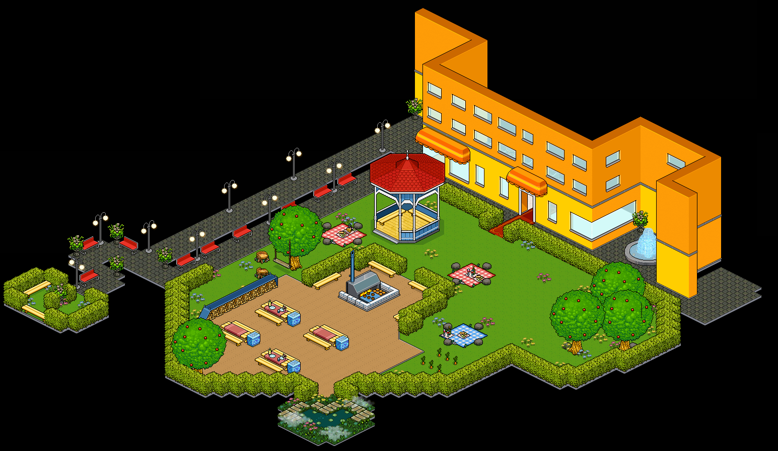
the flooring look So haphazard and Where is the seaside pier. I'm assuming they're going to put that awful background toner with the wrong colour and clouds. This is just wrong, awful blasphemy against the beauty of the old picnic area.
i really don't want them to use a background toner. why cant they just make the public rooms full screen like on old habbo or just make it a wall
Ikr! Background toners make the room look wrong and like its floating instead of grounded. The infobus park should've just been black. They really should make the rooms full screen, all the rooms so far has been smaller than their originals apparently because there isn't the default old zoom anymore
Don't forget Habbo have an sizechangable window (or what they're called), so you always can use fullscreen on whatever computer you use, and still see the same room.
I kinda like that the Picnic park seems to continue into the Infobus-area. And why would they use the same things as before??? If they redraw, why would they not get something new? I like that they add something new, and not stay with same old shit as before. Now we'll get an good looking room. Only bad thing is that tile-fitted thing on the left side, it should be an straight line and not following the tiles.
Of course they can change things up a little. But the fact remains that the old rooms were a lot better looking and its a shame to see new ones that do not make the mark. The new theatredome is a great new room and they did a great job but this is really bad. And we're talking about the old full screen public rooms.
shut up bitch nostalgiafag
Its not about being a nostalgiafag. its that the new rooms genuinely don't look as good as the originals. i actually like the new theater over the original. and i'm okay with change as long as it's for the better, but habbos changes are almost never better
Well said
Only pointing out what's present in old rooms but missing from the new ones or not the same is hitting the nostalgia pipe pretty hard if that's your basis of comparison. They never even said they would copy the old rooms in the first place so getting chuffed over them is a little silly.
You don't like the room designs, great you have an opinion, but it's an entirely subjective one. Let them exist for what they are, stop complaining over everything that doesn't match the old ones exactly, and be grateful they're making them at all.
The question is, how does Jeff, such an experienced designer make such sub standard designs? It's like they are changing things just for the sake of changing things and being new.
i know right. thats really the main issue. they went all out on the old public rooms. now compare the old infobus park to the new infobus ark. anyone who hasn't even played habbo before would like the older version, it looks so much more natural and like an actual outdoor room, this picnic doesn't have an outdoor vibe at all, idk if it because we can see the floor plan of the room now, or that the furni actually has a name or that it's not zoomed out anymore. it just doesnt look right
They are not even sticking with hotel view. The bottom half of walls are not yellow and it's not even going to be by the seaside now. And the ugly bulbous trees are appearing. The area for all the trees are gone. Half of the sitting area is also gone. The doors don't even open, they are going to place the tele tiles in front. They could have at least done the doors like the coffee place elevator entrance where it actually opens. I fear for the Lidos. Hopefully they do a theatredome and don't butcher the original. Sad to see such beautiful rooms becoming uglier. They could have made the public rooms full screen, that way it works on all screen sizes. It's because of mobile that they are shrinking all the rooms now.
Mobile is good market wise but creativity wise mobile seems like its limiting habbo so badly.. these are public rooms. the entire point of them were to be bigger than guest rooms and mimic a hotel. these new rooms do none of that. the new welcome lounge is so small and it doesn't feel like it would be part of a hotel at all, hell peoples fan art looks better than habbos actual rooms and thats sad
I agree. The welcome lounge looks nice actually just that it's too small. And when u enter the other hallways ur just greeted with that dull blue carpeting and after time the rooms lose their excitement. the HC club, someone could have thought to animate the fish tank. The place looks so dead and boring. games hub, it's a beautiful room gone to waste. And in all of these rooms there's an overwhelming amount of blue. Old rooms never really followed a theme they came in all sorts of colours so they didn't bore out fast
And as a senior designer, Jeff is just messing up the rooms too much. He's the only one working on the rooms even MrCroissant doesn't get to touch them. And they all refuse to accept that the rooms are substandard. They say that the rooms are beautiful pfft even Jeff. He was interested to see reaction for public rooms but only acknowledged the positive comments not the negative but more constructive ones. ffs the only reason why we like theatredome of all the new rooms is because the old was so boring.
The least they good do is get someone who played old habbo or worked on old habbo who was a graphic designer and have them do it, most of the staff we have now didn't play old habbo so they don't know how it felt, or how much better, and the staff that did play old habbo aren't the ones who make the rooms. it sucks really, habbo will never reach what it was 2006-2010, they cant recapture that feel and flare it had with these new designers
But Jeff was around since 07 that's the worst thing.
has he really? wow. he should understand why we dont like the new rooms the most
And I understand what you mean by the vibe. The old rooms would give so much joy but the new rooms already feel tired. I saw a comment somewhere about how the new rooms try to be modern but end up failing and looking old.
remember on shockwave habbo the public rooms used to fill the entire client window? why cant they do that anymore? it made them look so much more hotel-like and it didn't feel like you were in a room, felt like you were actually in a public space
I thought they were just gonna redo it. but i kinda like how the new one looks. so now i know 100% the lido won't look nothing the original
I only like the walls of the new one, they actually look nice and would look better with the Orange verandas. The flooring however... Looks so randomly placed and poorly thought out. what on earth at the two doors without the iconic red carpets, what's up with the small patch of ground to the left and they destroyed the main sitting area where the barbecue is. The pier is probably not going to appear and the trees could be replaced by the ugly infobus park ones. The trees of the old picnic area and infobus park were the most beautiful and detailed they already have the furni why not just reuse it.
Id be dumb of them not to re use the furni, honestly. im scared of what they do with the Lido deck. thats a room that cant change but knowing habbo they might butcher it
Probably, because of the mobile screen size, they will shrink the room. Probably not going to be as grand as the old one and not split in 2 they could have used the lido trees for infobus park tbh
Thank you to cite your sources (Mangetoica) ! The image name leaves no doubt

28 replies on “New public room (Picnic park)”
Horrendous
the flooring look So haphazard and Where is the seaside pier. I'm assuming they're going to put that awful background toner with the wrong colour and clouds. This is just wrong, awful blasphemy against the beauty of the old picnic area.
i really don't want them to use a background toner. why cant they just make the public rooms full screen like on old habbo or just make it a wall
Ikr! Background toners make the room look wrong and like its floating instead of grounded. The infobus park should've just been black. They really should make the rooms full screen, all the rooms so far has been smaller than their originals apparently because there isn't the default old zoom anymore
Don't forget Habbo have an sizechangable window (or what they're called), so you always can use fullscreen on whatever computer you use, and still see the same room.
I kinda like that the Picnic park seems to continue into the Infobus-area. And why would they use the same things as before??? If they redraw, why would they not get something new? I like that they add something new, and not stay with same old shit as before. Now we'll get an good looking room. Only bad thing is that tile-fitted thing on the left side, it should be an straight line and not following the tiles.
Of course they can change things up a little. But the fact remains that the old rooms were a lot better looking and its a shame to see new ones that do not make the mark. The new theatredome is a great new room and they did a great job but this is really bad. And we're talking about the old full screen public rooms.
shut up bitch nostalgiafag
Its not about being a nostalgiafag. its that the new rooms genuinely don't look as good as the originals. i actually like the new theater over the original. and i'm okay with change as long as it's for the better, but habbos changes are almost never better
Well said
Only pointing out what's present in old rooms but missing from the new ones or not the same is hitting the nostalgia pipe pretty hard if that's your basis of comparison. They never even said they would copy the old rooms in the first place so getting chuffed over them is a little silly.
You don't like the room designs, great you have an opinion, but it's an entirely subjective one. Let them exist for what they are, stop complaining over everything that doesn't match the old ones exactly, and be grateful they're making them at all.
The question is, how does Jeff, such an experienced designer make such sub standard designs? It's like they are changing things just for the sake of changing things and being new.
i know right. thats really the main issue. they went all out on the old public rooms. now compare the old infobus park to the new infobus ark. anyone who hasn't even played habbo before would like the older version, it looks so much more natural and like an actual outdoor room, this picnic doesn't have an outdoor vibe at all, idk if it because we can see the floor plan of the room now, or that the furni actually has a name or that it's not zoomed out anymore. it just doesnt look right
They are not even sticking with hotel view. The bottom half of walls are not yellow and it's not even going to be by the seaside now. And the ugly bulbous trees are appearing. The area for all the trees are gone. Half of the sitting area is also gone. The doors don't even open, they are going to place the tele tiles in front. They could have at least done the doors like the coffee place elevator entrance where it actually opens. I fear for the Lidos. Hopefully they do a theatredome and don't butcher the original. Sad to see such beautiful rooms becoming uglier. They could have made the public rooms full screen, that way it works on all screen sizes. It's because of mobile that they are shrinking all the rooms now.
Mobile is good market wise but creativity wise mobile seems like its limiting habbo so badly.. these are public rooms. the entire point of them were to be bigger than guest rooms and mimic a hotel. these new rooms do none of that. the new welcome lounge is so small and it doesn't feel like it would be part of a hotel at all, hell peoples fan art looks better than habbos actual rooms and thats sad
I agree. The welcome lounge looks nice actually just that it's too small. And when u enter the other hallways ur just greeted with that dull blue carpeting and after time the rooms lose their excitement. the HC club, someone could have thought to animate the fish tank. The place looks so dead and boring. games hub, it's a beautiful room gone to waste. And in all of these rooms there's an overwhelming amount of blue. Old rooms never really followed a theme they came in all sorts of colours so they didn't bore out fast
And as a senior designer, Jeff is just messing up the rooms too much. He's the only one working on the rooms even MrCroissant doesn't get to touch them. And they all refuse to accept that the rooms are substandard. They say that the rooms are beautiful pfft even Jeff. He was interested to see reaction for public rooms but only acknowledged the positive comments not the negative but more constructive ones. ffs the only reason why we like theatredome of all the new rooms is because the old was so boring.
The least they good do is get someone who played old habbo or worked on old habbo who was a graphic designer and have them do it, most of the staff we have now didn't play old habbo so they don't know how it felt, or how much better, and the staff that did play old habbo aren't the ones who make the rooms. it sucks really, habbo will never reach what it was 2006-2010, they cant recapture that feel and flare it had with these new designers
But Jeff was around since 07 that's the worst thing.
has he really? wow. he should understand why we dont like the new rooms the most
And I understand what you mean by the vibe. The old rooms would give so much joy but the new rooms already feel tired. I saw a comment somewhere about how the new rooms try to be modern but end up failing and looking old.
remember on shockwave habbo the public rooms used to fill the entire client window? why cant they do that anymore? it made them look so much more hotel-like and it didn't feel like you were in a room, felt like you were actually in a public space
I thought they were just gonna redo it. but i kinda like how the new one looks. so now i know 100% the lido won't look nothing the original
I only like the walls of the new one, they actually look nice and would look better with the Orange verandas. The flooring however... Looks so randomly placed and poorly thought out. what on earth at the two doors without the iconic red carpets, what's up with the small patch of ground to the left and they destroyed the main sitting area where the barbecue is. The pier is probably not going to appear and the trees could be replaced by the ugly infobus park ones. The trees of the old picnic area and infobus park were the most beautiful and detailed they already have the furni why not just reuse it.
Id be dumb of them not to re use the furni, honestly. im scared of what they do with the Lido deck. thats a room that cant change but knowing habbo they might butcher it
Probably, because of the mobile screen size, they will shrink the room. Probably not going to be as grand as the old one and not split in 2 they could have used the lido trees for infobus park tbh
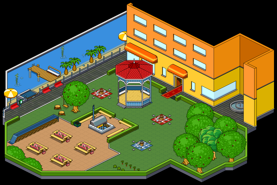
Thank you to cite your sources (Mangetoica) ! The image name leaves no doubt
>> https://twitter.com/MangeToiCa_FR/status/618163072902033408
Forgot to add, sorry!
Couldn't care less about public rooms unless it's SnowStorm lounge