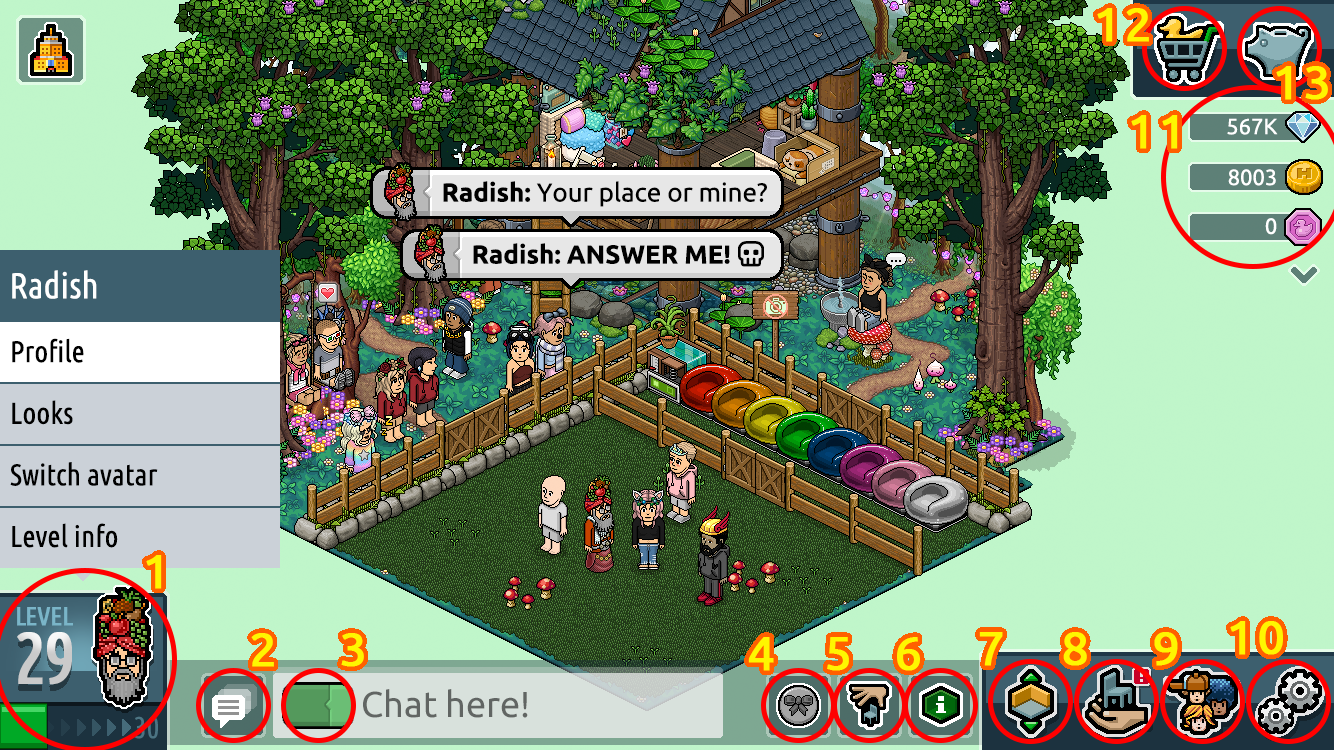
YOU CAN GET AN IDEA OF WHAT THE NEW UI LOOKS LIKE HERE:

1: Level
2: Chat history
3: Chat Bubble Colour
4. Group Icon
5. Build Mode
6. Room Info
7. The Navigator
8. Inventory
9. People
10. Settings
11. Purse
12. Shop
13: Pending income
NEW INFORMATION:
- The new client is being built with Unity, a cross-platform game engine.
- As time progresses, we'll be able to go into more detail about specific features and how they will look. Examples include Habbo profiles, the Marketplace, etc.
- While the new client will look and feel very similar to Habbo as it exists today, some things will look and function differently.
More information here: https://www.habbo.com/community/article/26309/habbo-2020
6 replies on “#Habbo2020: User interface! (desktop version)”
Not a fan, the UI is disgusting and too big imo
Me gusta pero no creo que deben poner otras con más importancia no solo esoxddddddd!
Disgusting
Habbo better sort it out and release a OLD SCHOOL HABBO client if this is gonna be the main game
This isn't a desktop version, it's a mobile version, the UI is almost the same.
I just hope that the "Settings menu" really have optimization options. Mute all, ignore trades, Click through players, Good click response (Unity should be enough), no 4 click lock.
If I was years younger and had the coin I would've pursued SiviCITY so much harder. Who knows? HTML5 MMO could've killed or sent Habbo into limp mode. :P
Voor 'n eerste schermfoto ziet 't 'r goed uit. Ik ben wel benieuwd naar de uitvoering voor grotere schermen of zullen ze een en dezelfde voor alle schermen gebruiken? Tot slot zou het ook mooi zijn om thema's (weergaven) aan het spel toe te voegen, zoals een donkere modus en een oude modus (oldschool).