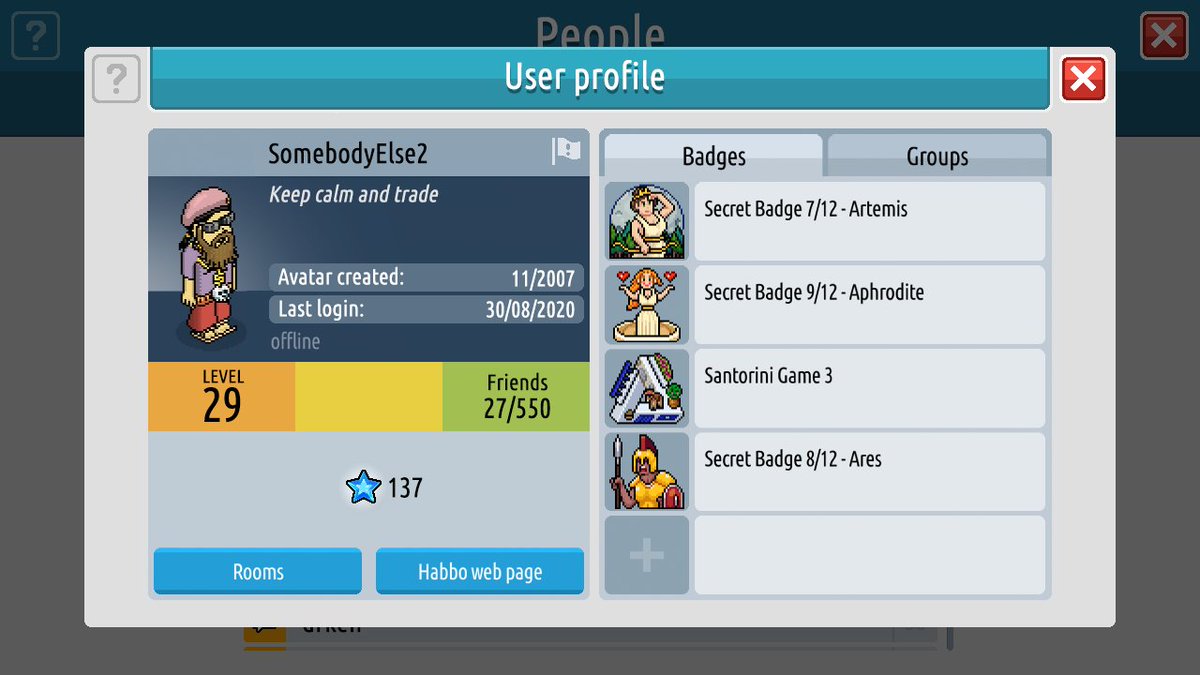
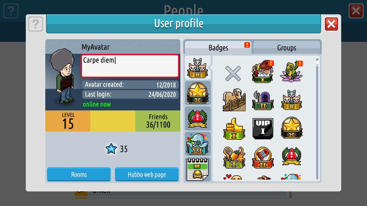
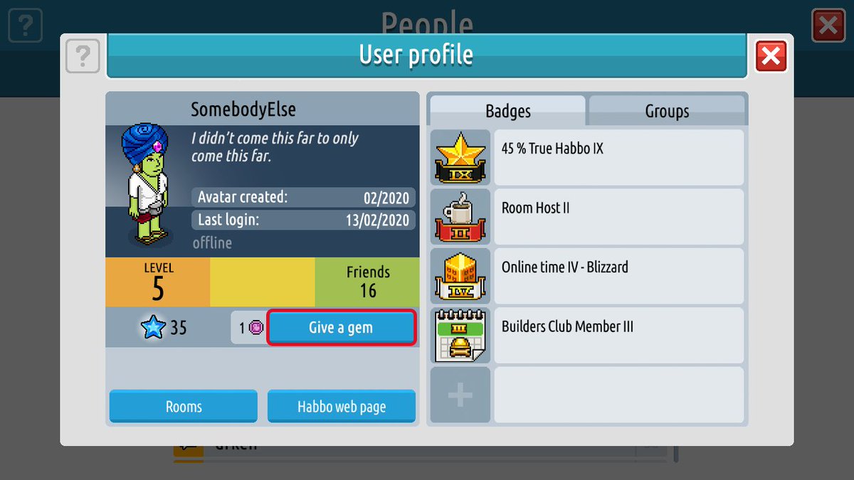
Habbo 2020's user profile window is changing.

Motto editing will be done from your profile, and you'll also be able to select badges to display on your avatar directly too! (Your user profile is where ALL your badges will be. They're being relocated from your inventory.)
Activity points are being replaced with achievement points in Habbo 2020. Your avatar level is determined by many things, achievement points being one of them.

The 'respect' feature is being replaced by something we've called 'Star Gems'. These can be given to other Habbos and they accumulate. And, as you can see, the amount your avatar has will be displayed on your profile!

(DIAMOND) New Achievements:


ACH_Profile_Gimmegimme_1 - ACH_Profile_Gimmegimme_10


ACH_Profile_Gimmegimme_11 - ACH_Profile_Gimmegimme_20


ACH_Profile_AssitCreed_1 - ACH_Profile_AssitCreed_10


ACH_Profile_AssitCreed_11 - ACH_Profile_AssitCreed_20


ACH_Profile_Pantheon_1 - ACH_Profile_Pantheon_10


ACH_Profile_Pantheon_11 - ACH_Profile_Pantheon_20


ACH_FriendsMaker_SGCollect_1 - ACH_FriendsMaker_SGCollect_10


ACH_FriendsMaker_SGGuru_1 - ACH_FriendsMaker_SGGuru_5
6 replies on “#Habbo2020 User Profiles”
I'm still not a fan of the UI, but hopefully some full UI screenshots in the upcoming weeks without the whole stuff zoomed in.
Interface looks very poorly
we see the zoomed things but how will be the client? I hope in the next weeks we will see more from that.
i have a bad feeling...
Not a fan of this UI at all, but it could look passable if there's a dark mode. The pixelly charm is what made Habbo so appealing in the first place for many people, and heading in this web 2.0-y direction is going to for sure put off a lot of older players who keep the economy going. They seriously need to share some zoomed-out screenshots for us to get a real idea of what we're going to end up with.
Looks like a cheap retro imitation, what a joke. Like the buttons have no depth, it's so shit.