




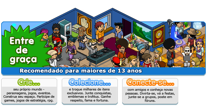
Now we still need to wait till these pages will be used..
These landingpages have been used on UK and US already, but THE other countries still use THE old one and these pages above will be used when all THE hotels get THE new landinpage.
- Haakon


Now we still need to wait till these pages will be used..
These landingpages have been used on UK and US already, but THE other countries still use THE old one and these pages above will be used when all THE hotels get THE new landinpage.
- Haakon
13 replies on “New Hotel Landingpages fo”
omg.... nice found the landingpage, images
A newbie called Technik found this one: http://images.habbo.com/c_images/Frontpage_images/landingPage_2_br.gif XD
those ones are already in use on both .co.uk & .com
Ik vind het wel mooi.. beter als nu
maar ze hebben zich wel weer lekker aangepast aan die date x hate noobs en die soek je liefowrdJ met dat DATE.. gedeelte. Beetje jammer vind ik dat
This is UK's one I know its so old but you still might want it
http://images.habbo.com/c_images/Frontpage_images/landingPage_starbtn.gif
I prefered the old ones...
ja idd, dat kunnen ze veranderen met:
[b]speel[/b]
maak vrienden, feest chill of ruil.
what about habbo.dk? :S We need more about that *LOL* :P Uhm.. hopes on new items :) AND BADGES!!! Next collectibles? :o And what the items can do? o.o' and maybe a site with help to your site? :S (a site about HTML).. because I'm SUCKS! :P -As
Ze kunnen beter eerst die noobs met al die kamers op alle etage's bannen en hun kamers verwijderen zoals kirby deed.
LOL
.Com was the first to use this and made this.....
Thanks to NME....
We have had that landing page for like 2 months now...
HIUHI
Sometimes, people want to revise things and make it very much better. But sometimes, they make it SO better, that it is being ugly. Thats, what Sulake is doing right now.
Just leave the Home Page: it is very nice thats wide but the combination is very ugly :S
[u]Olen suomesta[/u] (A)